KiDSiE
Case Study Summary
Our Challenge
KiDSiE sells quality children's products at reduced prices, including returns, clearance, and discontinued items. However, confusing site structure and language made shopping difficult. Our goal was to improve product discoverability, build trust, and enhance the user experience while staying true to KiDSiE’s brand.
Our Approach
Working in a small team, we followed the Double Diamond design process. Our research objectives where to:
Understand what people value when shopping for children?
Understand what people expect when shopping for an item that is not new?
Our Solution
We made targeted improvements with minimal disruption:
Clearer product descriptions using a traffic light system to replace confusing terms like "open-box"
Simplified navigation based on open card sorting for better usability
Redesigned homepage and product pages to highlight key info like condition, discounts, and returns
Improved engagement with responsive hover cards for quick product insights
The Impact
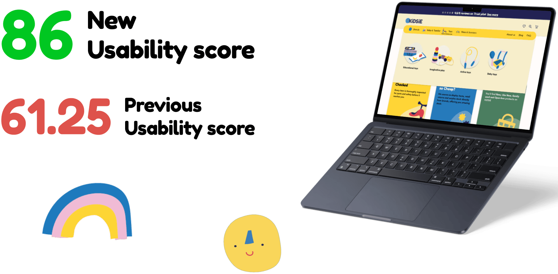
Our final usability testing saw the SUS score jump from 61.25 to 86, a dramatic improvement. Parents found shopping easier, trusted the descriptions more, and engaged longer with the site.
By focusing on clear communication, seamless navigation, and user trust, we helped transform KiDSiE’s website into a more intuitive and enjoyable shopping experience.
Full Case Study
Will Only Take 5 Mins
KiDSiE

KiDSiE is a children’s product retailer that offers high-quality items at reduced prices. Through competitor analysis, discussions with the owners, and data review, we identified issues with conversion rates.
We set out to speak with a diverse group of parents to better understand what might be causing issues with the site.
Research
Objectives
Understand what people value when shopping for children?
Understand what people expect when shopping for an item that is not new?
We interviewed 15 parents, aunts/uncles, and grandparents to gather qualitative insights into their shopping habits, frustrations, and decision-making processes. We also analysed competitor websites and tested KiDSiE’s existing platform to identify usability issues.
Key Takeaways
Parents prioritise product quality and safety when shopping for children.
Unclear terminology (“open-box”) created confusion and reduced trust.
Community recommendations and social proof significantly influence purchasing decisions
Who is the Target User?
A budget-conscious mum focused on value and quality. This user remembers spending too much on their first child and is eager not to make the same mistake this time around. When shopping, they want to feel confident that the products are safe and offer good value for money.
Some key frustrations included:
Confusion around product condition due to unclear terminology
Hesitation to purchase without sufficient trust signals.
Frustration with site navigation and difficulty finding key product details.
Why we made a persona? Creating a clear, vivid persona of our stereotypical user (Anya) made it easier to design with purpose. By grounding every decision in making their experience smoother.

Key "How Might We" Questions
We then asked ourselves how we might address some of these pain points. Each of us aimed to come up with 16 ideas, and then we voted on our favourites.
How might we improve product descriptions to make purchasing decisions easier?
How might we build trust and transparency within the shopping experience?
How might we enhance navigation to streamline the user journey?

A More User-Friendly KiDSiE
During our research, we explored the psychology behind consumer trust. We found that clear language, visible quality assurances, and community engagement all play a vital role in building user confidence. By refining KiDSiE’s messaging and site structure, we aimed to strengthen trust in the brand.

SOLUTION 1: Clearer Product Descriptions
We replaced the term “open-box” with the clearer “pre-opened” and introduced a traffic light system using KiDSiE’s colour palette to indicate product condition. Rapid A/B testing across diverse age groups validated both clarity and accessibility.
Green – New
Yellow – Gently Used
Pink – Pre-Opened
These changes aligned with user expectations and increased clarity.
SOLUTION 2: Improved Trust Signals
We incorporated customer reviews, verified seller badges, and detailed return policies on product pages. Additionally, we added a “Quality Guarantee” section to reassure buyers about product safety and durability.
SOLUTION 3: Improved Trust Signals
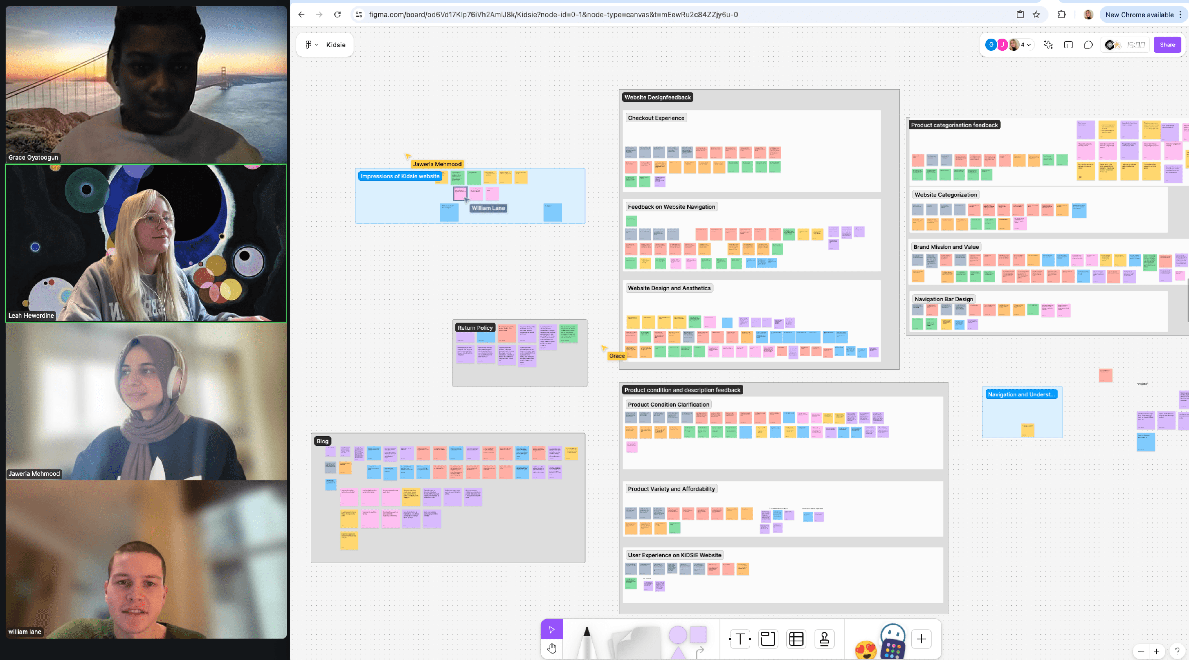
We conducted open card-sorting exercises to create a more intuitive sitemap. The new structure clearly categorises products and simplifies filtering, making it easier for users to find relevant items.

Refinement
To refine our ideas, we created initial sketches and voted on the strongest concepts:
A redesigned homepage with clear trust signals.
Improved product pages with enhanced descriptions and visual cues.
A refined navigation system based on user feedback.

Prototyping and Testing
We began with a low-fidelity prototype to quickly test core ideas, then developed two high-fidelity versions based on feedback.
The primary prototype focused on three key fixes to boost user trust—testing confirmed users valued the clear, transparent design. The second version introduced enhanced UI, smoother animations, and a cleaner homepage. I also created custom menu sections and illustrations (like the skipping rope and baby pusher), all styled to match the brand and improve navigation consistency.
Conclusion
IMPACT
Our final design successfully tackled KiDSiE’s key challenges, making it easier for parents to shop with confidence. By improving product transparency, enhancing trust signals, and optimising navigation, we elevated the user experience while staying true to KiDSiE’s brand values.
After presenting our work to the clients, Matt and Jen, they were highly impressed with the improvements. We provided them with a detailed FigJam file outlining our findings and recommendations. This project was a fantastic learning experience, reinforcing the importance of research-driven design in creating meaningful user experiences.
FUTURE POTENTIAL
With more time I would have explored the UI in greater depth. Particularly how visual hierarchy, micro-interactions, and consistency can influence user trust and engagement. Throughout the iteration stage, it became clear that small UI refinements can have a massive impact on how users perceived the brand.